Have you ever wondered what your network looks like? I mean, you have loads of people in your network, but how do you know them and how do they know each other?
LinkedIn labs has a tool called inMaps and you can do just that, visualize your network. It may take a while for that first run (depending on how many connections you have) but it is a great way to look at your network.
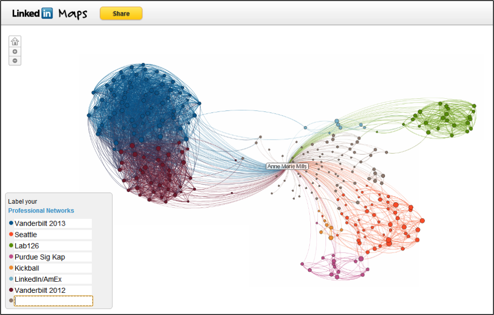
Here is a picture of my network last March, you’ll see that I have about four main clusters; Vanderbilt Class of 2012, Class of 2013, Seattle (my friends and coworkers from my time there), and Lab126 (where I interned before coming to Vanderbilt).
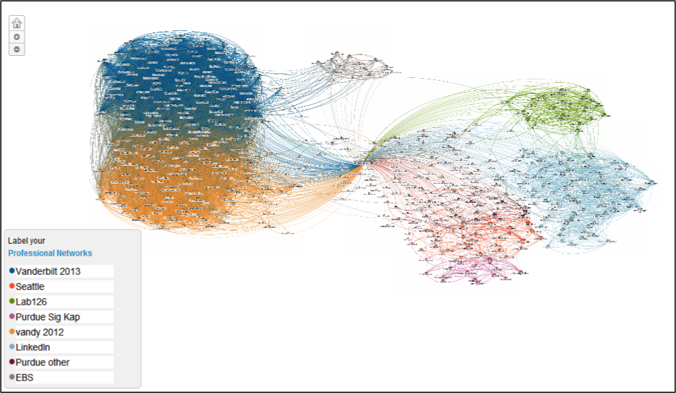
And here is my network as of September, you’ll see my clusters have grown and I’ve added one big one from being at LinkedIn (any one surprised?) and one small one that is comprised of people I met while studying abroad in Germany at European Business School.
What is really important about these maps is to know where you are the most valuable to your network. Any time you are the single point that can connect people; you become more valuable. For instance, say someone here at Vanderbilt is interested in working for LinkedIn; I’m their girl! Or say one of my Purdue friends is interested in starting their MBA at Vanderbilt; again, I’m their girl! This is what networks are all about and why it can be so helpful to visualize your network.
Check it out today at inmaps.linkedinlabs.com and watch your network grow!


Thanks Anne Marie! I tried to find this on LinkedIn last year and was unsuccessful. Glad to see how I can visualize my network now.
Pingback: Daily Link Roundup 09-11-12 | OnlineMBANoGMAT.info